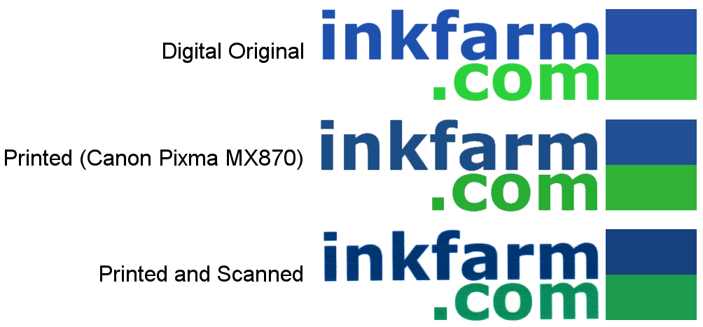
Recently we had a few business cards made with a simple logo on them. There were only two colors and it seemed pretty straight forward to get what we wanted. We soon got a lesson in the difficulties in color management with just this basic request. What we learned was that matching colors across multiple devices is really difficult. Taking a digital image either from an image editing program or a camera and then moving it from computer to computer or printing it can have a significant impact on how the colors on an image are going to end up. This gets even more difficult when working with multiple people and their computers. Even a simple digital image, like the logo on our business card, can be very difficult to match perfectly. Luckily there are a few tools and solutions for getting the colors you want across multiple devices.
Mechanical devices use numerical algorithms to create colors. CMYK, RGB, Pantone and various other systems all use reproducible combinations of primary colors to consistently make a wide spectrum of colors. However, the algorithms may run on completely different systems (CMYK vs. RGB for example) and thus they will have trouble creating identical images between the two of them. Even devices that use the same system, like two monitors for example, may have different individual settings such as brightness or contrast and may look very different from one another.
To control for all of these variables there are a number of color management tools that can help give you consistency in all the devices you are working with. In this article we are going to first look at the different types of color systems and then how to bridge the gap between them. Color management can be as easy or as complicated as you want it to be and this article is here to give you the basics about how you can gain some control over your final product.
Here is the logo across a few devices. The original version created on the computer is markedly different when compared to the printed and scanned version without any color management.
You Can't Trust Your Eye
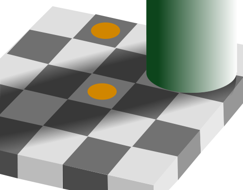
The challenges of color management come from both how the devices function and how the human eye perceives color. When we see a color we are not getting an isolated image, instead what we see is effected by the context of the image. Our perception of what a color is can be very subjective which is why mechanical color matching is so important.
The two squares with orange dots are exactly the same color but the one in the "shadow" appears darker.
Mechanical devices use numerical algorithms to create colors. CMYK, RGB, Pantone and various other systems all use reproducible combinations of primary colors to consistently make a wide spectrum of colors. However, the algorithms may run on completely different systems (CMYK vs. RGB for example) and thus they will have trouble creating identical images between the two of them. Even devices that use the same system, like two monitors for example, may have different individual settings such as brightness or contrast and may look very different from one another.
To control for all of these variables there are a number of color management tools that can help give you consistency in all the devices you are working with. In this article we are going to first look at the different types of color systems and then how to bridge the gap between them. Color management can be as easy or as complicated as you want it to be and this article is here to give you the basics about how you can gain some control over your final product.
Best Toner Saving Printers of 2016
Best Ink Saving Printers of 2016
Recommended Ink Saving Fonts
What the Font?
1 Comment
ARCHIVE
April, 2016
Best Toner Saving Printers of 2016
Best Ink Saving Printers of 2016
June, 2015
Best Ink Saving Printers 2015
May, 2015
Customers Love Inkfarm
Customers Love Inkfarm
May, 2014
Aspiring Business Contest Winners
March, 2014
Win A Printer For Your Business Or Start-Up!
February, 2014
Best Ink Saving Printers 2014
January, 2014
New Year, New Beginning Contest Winners
3D Printing for 2014
December, 2013
Printing Nuances and How to Fix Them
"New Year, New Beginning" Photo Contest Guidelines
Printable Holiday Elf Decoration
November, 2013
Printable Thanksgiving Decoration
September, 2013
2013 DIGITAL INNOVATION SCHOLARSHIP WINNER
July, 2013
About the Lexmark 200xl compatible ink cartridges
Page yield ratings and coverage percentages explained
Black and Tri-color cartridge pre-installation guide
Multi-color cartridge pre-installation guide
Alien Earth Photo Contest Winner
May, 2013
"Alien Earth" photo contest entry guidelines
Digital Innovation Scholarship 2013
Best Toner-Saving Laser Printers - 2013
April, 2013
Epson ink cartridge pre-installation guide
March, 2013
Best Ink-Saving Printers 2013
October, 2012
Breathtaking Portraits Photo Contest Winners
September, 2012
How Planned Obsolescence Affects You
$100 Photo Contest
August, 2012
GeekGirlCon 2012 Review
Drupa 2012 highlights
July, 2012
2012 Consumer Printer Trends
Laser Printers vs. Inkjet Printers: Pros and Cons
Sizzling Summer Photo Contest Winners
June, 2012
Why is Printer Ink so Expensive?
Genuine vs. Remanufactured and Compatible Cartridges
Funniest Candids Photo Contest Winners
May, 2012
A Glossary of Popular Printer Terms
Crafty Fridays: Printer Ink Cartridge Stamps
How to Make a Shower Karaoke with your iPad!
Almost Human Photo Contest Winners
Upcycling Ink Cartridges
April, 2012
5 Tips on Saving Printer Ink
Top 4 Printers of 2012
Best Ink-Saving Printers - 2012
Free Ink Giveaway
Talking GeekGirlCon with Susie Rantz
Beat the Winter Blues Photo Contest Winners
March, 2012
Laser "Un-printer" Wipes Paper Clean
Owning a Hackerspace: An Interview with Matt Westervelt
Instaprint: The Polaroid of Today?
Why you Should Print your Tax Return
H&R Block Online: How to Print your Tax Return
TurboTax Online: How to Print your Tax Return
How to get Copies of Previous Tax Returns
Printing from the Cloud
iPhone Photo Contest Winners
January, 2012
Seasons Greetings Photo Winners
December, 2011
Saving Your Photos in the Digital Age
12 Great and Free Holiday Fonts
Urban Black and White Winners
October, 2011
Photography Contest #2- Awesome Autumn
Kodak Stock in Free-fall
September, 2011
Bright and Beautiful Colors Winners
Photo Contest Terms and Conditions
August, 2011
DPI and Image Size
Printing On Photo Paper
Google Cloud Print From Your Android Phone
Google Cloud Print From Your iPhone
Digital Camera Modes
Photo Paper Types
GIMP Tutorial: Introduction GIMP Tools
The Cost of Digital Cameras
Compatible FAQ
July, 2011
Image File Extensions
Color Management Basics Page 3
Color Management Basics Page 4
Color Management Basics
Color Management Basics Page 2
Apple Loses in Kodak Patent Suit but Kodak Stock Falls
June, 2011
Printer Software for Saving Ink
Conservation and the Environment
Recommended Ink Saving Fonts
Best Printers for Saving Ink - 2011
May, 2011
Printer Ink - Toxic?
March, 2011
Holy Fonts, Batman!
What the Font?
Are Page Yield Ratings A Scam?
© 1999-2016 Inkfarm.com, Inc. All rights reserved. "The ink & toner super site" is a trademark of Inkfarm.com, Inc.
http://www.inkfarm.com/Printer-Ink--Toxic
To prove the point of color algorithms and perceptions, I am viewing page 1 of "Color Management Basics" on my MacBook OS 10.5.8 and I see just the opposite of the diagram caption:
"The two squares with orange dots are exactly the same color but the one in the "shadow" appears darker."
But now that I reexamine it, the caption isn't clear about what is the same. Is it the two orange dots are the same color, the gray squares are the same shade of gray, or both are the same.
My eyes and Mac say the orange dot in shadow is brighter and the square in shadow is a lighter shade compared to the square with the dot in the lighted area.
picky picky pixels